Entry 2 – Helvetica – Hannah May 24, 2009
Posted by hannah (: in Entry 2.add a comment
Helvetica, was developed in 1957 by Swiss typeface designer Max Miedinge with Eduard Hoffmann and is a widely used sans-serif typeface. Originally called Die Neue Haas Grotesk, the aim of the new design was to create a neutral typeface that had great clarity, had no intrinsic meaning in its form, and could be used on a wide variety of signage.
In 1960, the typeface’s name was changed to Helvetica, the Latin name for Switzerland — in order to make it more marketable internationally.
The first Helvetica typeface I found when on my searches, was this handy un-opened Post-it notes packet on my fathers desk.. I thought it should be a good enough example of the typeface, so I took the picture. (and included myself for some reason)
I chose this particular image (although it was the first I found..) because the use of Helvetica in this logo is effective in different ways. It keeps a professional “business” type look, yet also says; simple, straight forward and useful.
Helvetica is over fifty years old and is the most widely used font ever, yet comes across differently with different products/logos. And is why I like Helvetica.
Entry 2 – Helvetica- Courtney-Jayne May 20, 2009
Posted by courtneyjayne in Entry 2.add a comment
 Here is an example of helvetica font usage…. helvetica i used all around us its not till you take a good look then you will notice exacally how much this fonts actually used…
An example of a sans-serif typeface. These first appeared in the late 19th century in Germany and flourished in the 1920s and 30s, when they were regarded as the future of typography. Its more a geometric design than the humanist design of Gill Sans, but less geometric than Avant Garde and Futura. Helvetica has is considered and overused typeface by many type users, novice and expert. Its innate form lacks the elegance of Frutiger’s Univers, but it does retain legibility at small sizes on a computer screen. In fact, 9 point Helvetica (from the bitmap-not interpreted TrueType) is more spatially economical than most other typefaces.
Entry 2 – Helvetica – Daniel King May 8, 2009
Posted by danallmighty in Entry 2.add a comment
Helvetica, a term which means “Swiss”, is a type-face developed by Max Miedinger along with Eduard Hoffman in Switzerland, 1957. It has been used on everyday objects such as warning signs and computer software to Unitied States space shuttles. The simple lines and neutrality of the font lead it to be the most widely used type-face, so much so that today it has become generic and bland as opposed to its fresh and innovative beginnings.
Entry 2 – Helvetica – Elaine Aupaau May 8, 2009
Posted by e7777 in Entry 2.add a comment
Helvetica is a widely used sans-serif typeface developed in 1957 by Swiss typeface designer Max Miedinger. Helvetica was rated number one on fontshop Germany’s list “Best Fonts of all time”.
- 12/04/09
Our tutor told us to find examples of what helvetica is or where it’s used. This is an example of Helvetica, and it’s been used at a thermal park in Taupo and was taken on a sunday afternoon, I remeberd that i took some warning signs, so I thought I would use this as an example for Helvetica, there are other images but there abit fuzzy and not really clear to read so I like this image the most.
By Elaine Aupaau.
Entry 2 – Helvetica – Jamin May 8, 2009
Posted by topdogs05 in Entry 2.add a comment
This photo was taken in my classroom. The EXIT sign. Most people take no notice of it until the time something happens, then we seem to search it out like a moth to the flame.
The reason I think we ignore this sign is that Helvetica has feeling that goe’s along with it, because it’s so universally used most people don’t see or think it has a speciality which is associated or attributed with it and so it’s more of a nuetral font style which is why most designers like to use it. Other reasons why it’s we’ll used is because it’s a clean, easy to read design and it’s flawless.
So this is why I think this font was selected for the task, it communicates control and structure. Maybe that’s what they were wanting people to feel a sense of calm, control and order.
I think they did there homework when deciding on this font to be used, whom every made these sign’s
It does the job.

- Photo of Exit signage
Entry Two – Helvetica – Marty L May 8, 2009
Posted by Marty in Entry 2.add a comment
 Helvetica. A font designed in 1957 by a man named Max Miedinger, with the help of Eduard Hoffmann, in Switzerland. The font was created to meet the expectations of it being very clear, with no meaning, and of it being able to be used in a large variety of advertising media.
When I saw that Dick Smith used the Helvetica font face, I took a photo – as we have a task of writing up a blog on Helvetica – to show the ease that the Helvetica font has on the eyes. It fits its role as a meaningless text that, without any hidden attraction behind it, displays the text “Dick Smith” clearly and boldly. It works.
Entry 2 – Helvetica – Chris Norris May 7, 2009
Posted by buu122 in Entry 2.add a comment
We were asked to find and take a picture of the famous Helvetica Font, I choose to use the Mcdonalds Sign. Because its well known and has a well designed logo.
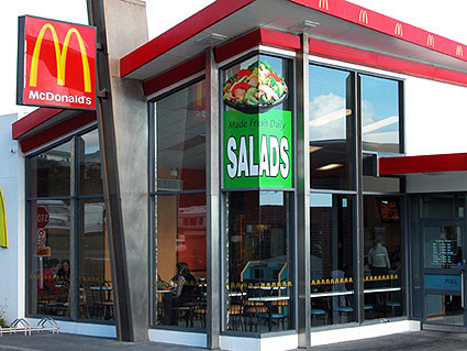
Mana Mcdonalds
Entry 2 – Helvetica – Lisa May 7, 2009
Posted by Lisa Fraser-Clark in Entry 2.add a comment

Me pointing at some helvetica in Porirua
I found this example of Helvetica around the corner from the Warehouse in Porirua. It was on the fence in front of their dockway.I chose this example of Helvetica becasue I liked it. It is saying DANGER ELECTRIFIED FENCE and the Helvetica makes it clear to read. I also like the juxtaposition of having the font in different colours on the same sign. This sign is just under the sign for the Warehouse, which looks very similar, but it is in Arial, not Helvetica. The two signs do look like they are using the same font except if you look closely at the ‘S’ on Warehouse. In Helevetica the terminals on the ‘S” end on a horizontal line. I like the sign iin Helvetica better as it looks better visually.
Helvetica Font – Tane May 7, 2009
Posted by horeyezon in Entry 2.add a comment
I didn’t have much time to get get details of an image – but after dropping off my carload of school mates I visited my local printer in Paraparaumu and asked it they had any display formats of the Helvetica font in use. To my supprise they did and here are a few images taken with my phone. I have blown them up into photoshop then illustrator and added a background and layered the images over each other.
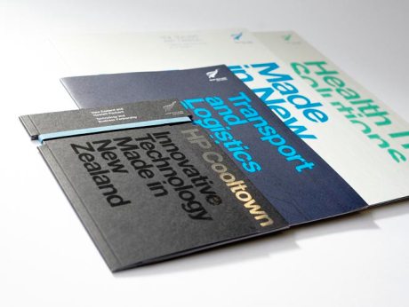
I reconised the Helvetica used in all these formats – I see how with the gradiants you can make them almost come to life. I thought yeah we see them everyday, but to use them in promotion files like the Paraparaumu Printers have used here, boggles the mind! as to what we can all do in the future with the fonts we choose to use. The use of colour has played big in all of these image formats. not only by giving out a message but by what type of clean crisp and bold font types to use, these colour ranges can change at any time but if it doen’t look good then try again until the proof looks right.
Entry 2 – Helvetica – Chanelle Tearikiaua May 7, 2009
Posted by diizzy in Entry 2.add a comment
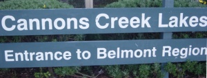
Cannons Creek Lakes
We were asked to find a picture of Helvetica and then write about it so today I’ll be talking about the sign that leads to Cannons Creek infamous duck pond. Here we have a sign that has used the Helvetica font. The words “Cannons Creek Lakes” is in a larger font size compared to the sign below it that says “Entrance to Belmont Region”. If someone were to ask me why I think this works well I’d have to say it’s because its clean, crisp and clear to the eye. The bold font and finely cut letters mean that it doesn’t make it hard to read at all and the white font that contrasts with the dark green background also makes it easier for the eye to read. If an outsider that had travelled to Cannons Creek or Porirua in particular was looking to find this place they’d have to drive along the main road and that’s where the sign is avaliable to the public eye, so if they were looking for the Lake of Cannons Creek I think it’d be easy for them to find this location thanks to this sign.
![hannahandpostits=] Helvetica Typeface displayed on Post-it notes + a hannah in the background :D](https://contextualstudies.files.wordpress.com/2009/05/hannahandpostits.jpg?w=460)
