Entry 2 – Helvetica – John Hughes May 7, 2009
Posted by johnm2 in Entry 2.add a comment
John Hughes
Helvetica
The Helvetica typeface was originally designed by Max Medinger in Switzerland in 1957. The purpose was to create a type that could be used in a number of cases but would not detract from the idea or product.
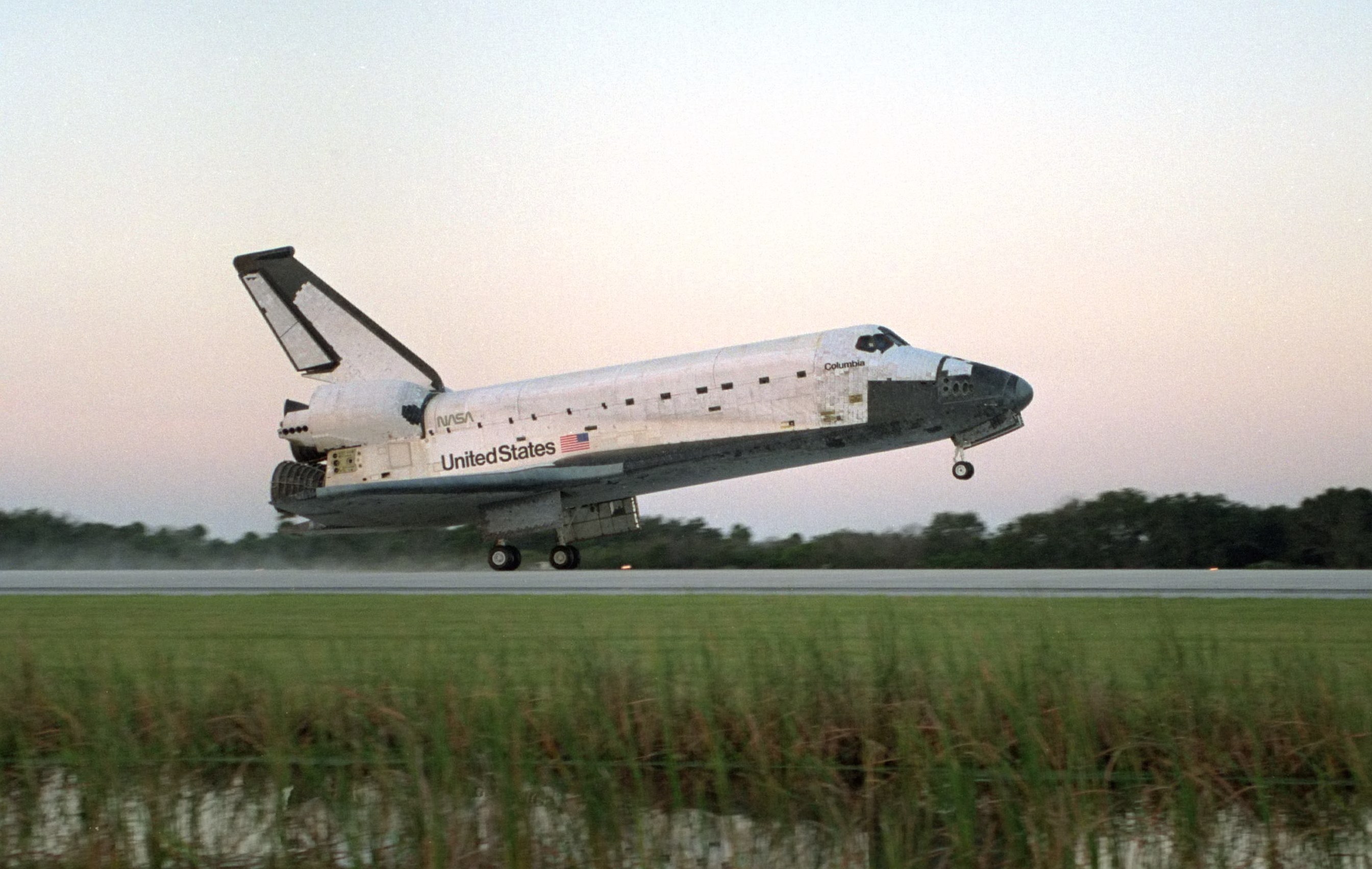
In order to market it successfully, the name Helvetica became its title. It is now used all over the world on titles, signposts, advertising and public information signboards. It has even been into space as the signage on American rockets.
Unlike most typefaces, Helvetica is not freely available but the owners charge users. The cost varies from $NZ43 to over one thousand dollars depending on the version and the usage. That users are willing to pay for using it, shows its superiority.
Naturally, there are copy versions freely available. The closest are Arial and Microsoft Sans Serif. These are illustrated and can be compared with the original Helvetica. The closest copy is Arial which has minimal differences in the alphabetic characters, for example capitals C, G, and R are all different.
Microsoft Sans Serif has the appearance of Helvetica but can be recognised as different, however these differences could be to evade the intellectual property rules.
A tribute to the popularity of Helvetica has been the number of fonts that bear a similarity to the original font. That Helvetica continues to be used, demonstrates its universal acceptance and preference to its copyists.
Helvetica
(Note: The print of Helvetica would not reproduce on this blog. Should the tutor require this, a copy can be produced)
Arial
abcdefghijklmnopqrstuvwxyz
ABCDEFGHIJKLMNOPQRSTUVWXYZ
1234567890(..,,)>><</~$£&%@!*
Microsoft sans serif
abcdefghijklmnopqrstuvwxyz
ABCDEFGHIJKLMNOPQRSTUVWXYZ
1234567890(..,,)>><</~$£&%@!*
The original requirement was for a piece of text, printed in Helvetica. I chose not to do this so that I could compare Helvetica with fonts that are imitations and are distributed without charge. . I got the sample of Helvetica from the Letraset catalogue and the others came from Word 7.
Enrty 2 – Helvetica – Joe May 6, 2009
Posted by maxbroderick in Entry 2.add a comment
This blog task is all about Helvetica, What we had to do was go for a walk and find an example of Helvetica and i found the “Briscoes” sign, the reason i liked this sign was because the sign has to versions of Helvetica and this made it a great example because it displays two very different variations of the same font, in it the first been big and bold and saying “Briscoes”

Briscoes Sign
and the second saying home wares in a smaller much less bolder font. Helvetica has been around for over 50years and it is still been used as a major part of our lives and a Major part in the advertising industry to day.
Entry 2-Helvetica-Christina May 6, 2009
Posted by Christina Naidu in Entry 2.comments closed
![]()
Hello! 😀 I found this helvetica font from a car. I chose this image because it caught my eye! 😛 I really liked the way how the helvetica font was layed out. I think that the helvetica font face makes the logo/company name stand out because of the choice of colour that they used. I thought it was good of them to make the helvetica font silver and shiny over a black background, because to me if the background is a bright colour, the font colour should be dark. Or if the background is a dark colour, the font colour should be bright. This is so the image will be readable.
Entry two – Helvetica – Arden May 6, 2009
Posted by ardentttt in Entry 2.add a comment

Here is my example of helvetica, I chose this image because I’m sure most of us can relate to toilets..
being that we all use them and these signs are everywhere in malls, trainstations, fast food outlets etc.
Helvetica was developed 1957 by two typographers; Max Miedinger and Eduard Hoffmann in Münchenstein, Switzerland. Their goal was to create a “neutral typeface that had great clarity, had no intrinsic meaning in its form, and could be used on a wide variety of signage”.
The original name for Helvetica was “Neue Haas Grotesk” but was changed in 1960 to Helvetica which means “The Swiss Font.”
