Entry 2 – Helvetica – Chanelle Tearikiaua May 7, 2009
Posted by diizzy in Entry 2.trackback

Cannons Creek Lakes
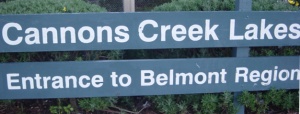
We were asked to find a picture of Helvetica and then write about it so today I’ll be talking about the sign that leads to Cannons Creek infamous duck pond. Here we have a sign that has used the Helvetica font. The words “Cannons Creek Lakes” is in a larger font size compared to the sign below it that says “Entrance to Belmont Region”. If someone were to ask me why I think this works well I’d have to say it’s because its clean, crisp and clear to the eye. The bold font and finely cut letters mean that it doesn’t make it hard to read at all and the white font that contrasts with the dark green background also makes it easier for the eye to read. If an outsider that had travelled to Cannons Creek or Porirua in particular was looking to find this place they’d have to drive along the main road and that’s where the sign is avaliable to the public eye, so if they were looking for the Lake of Cannons Creek I think it’d be easy for them to find this location thanks to this sign.
Comments»
No comments yet — be the first.